Seattle Cascades
60th Anniversary
/
Temporary Identity Rebrand

Concept
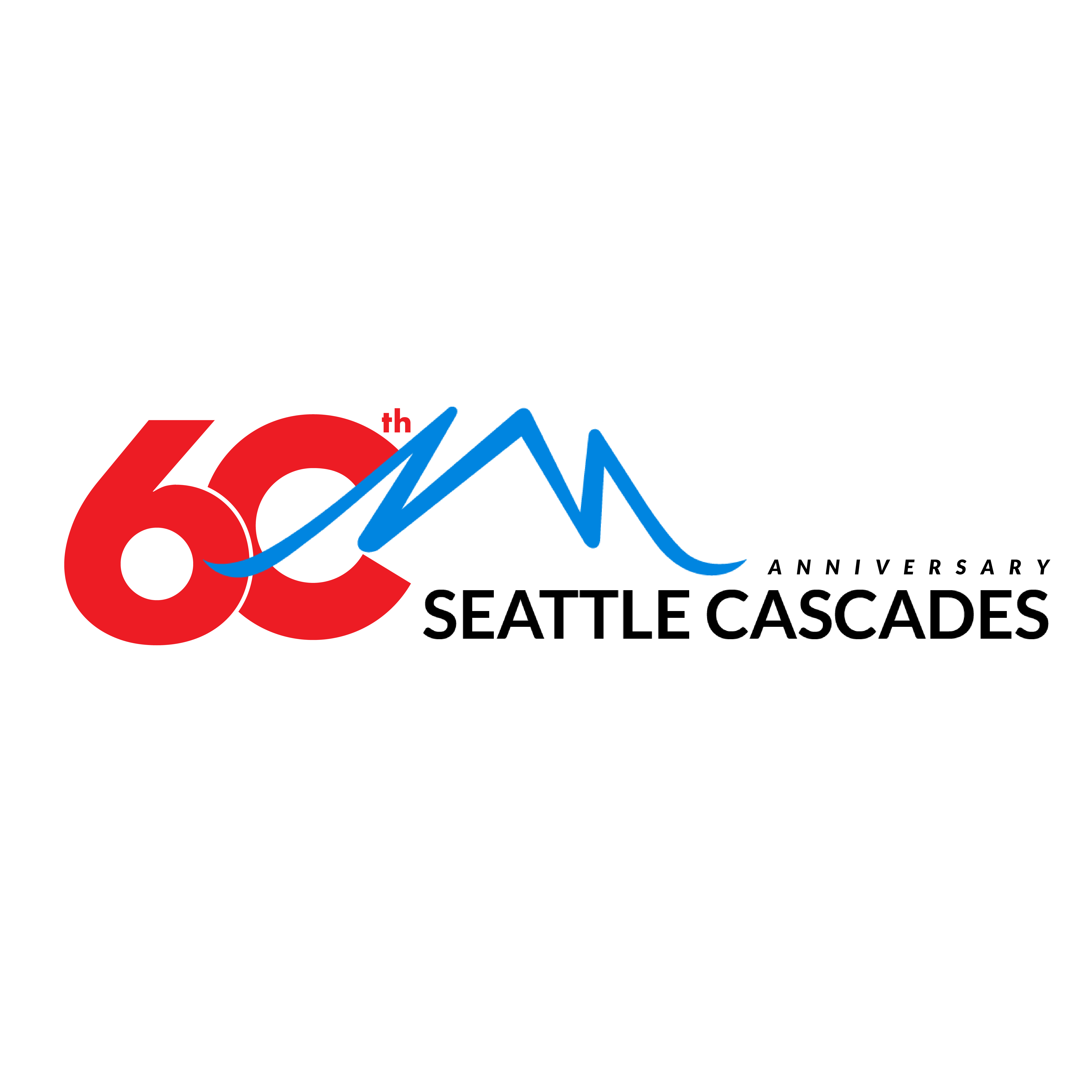
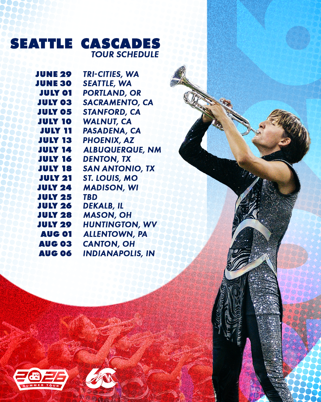
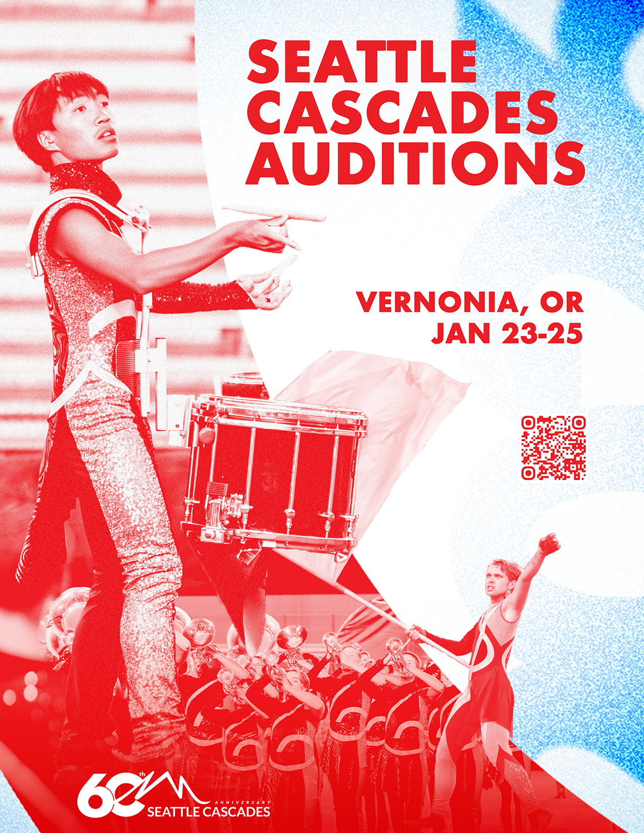
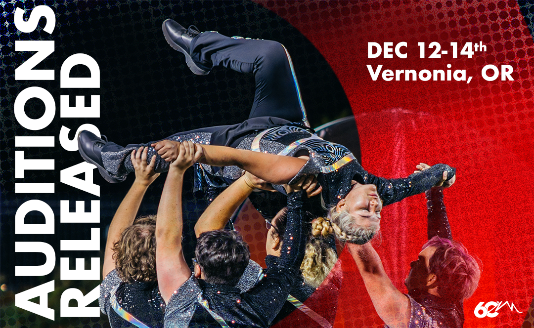
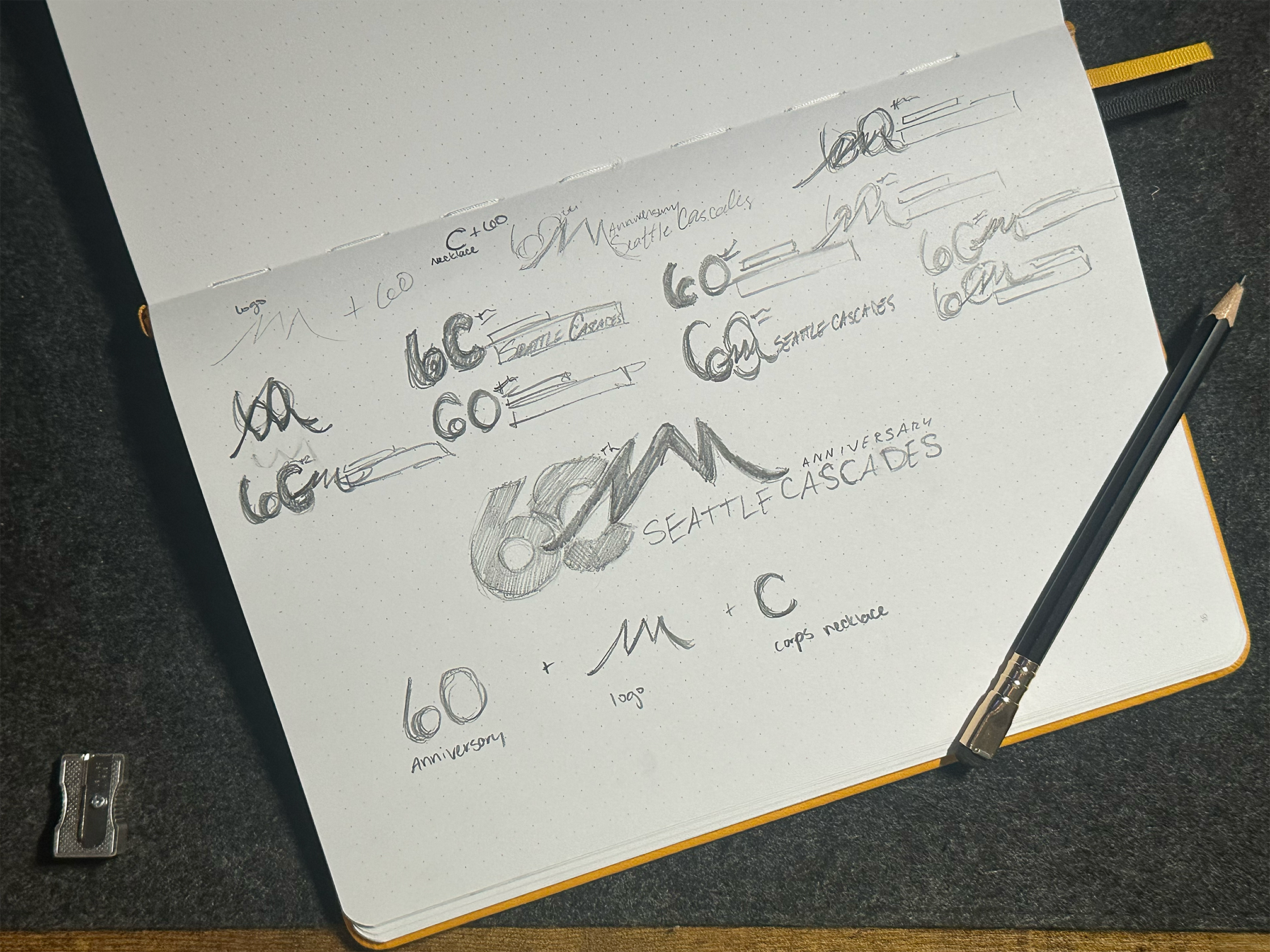
The color palette calls back to the original set of Seattle Cascade logos. Bold, geometric, sans serif fonts are reminiscent of the swiss-style 60’s when the corps was founded. The new, mountain brand-mark was incorporated for continuity (also it’s stinkin’ cool), and cuts the 0 into a bold, circular C— referencing the corps’ necklace pendent. Textured geometric shapes and half tone gradients call to the height of print media, taking a new spin on old event posters.