Creative Marching Solutions

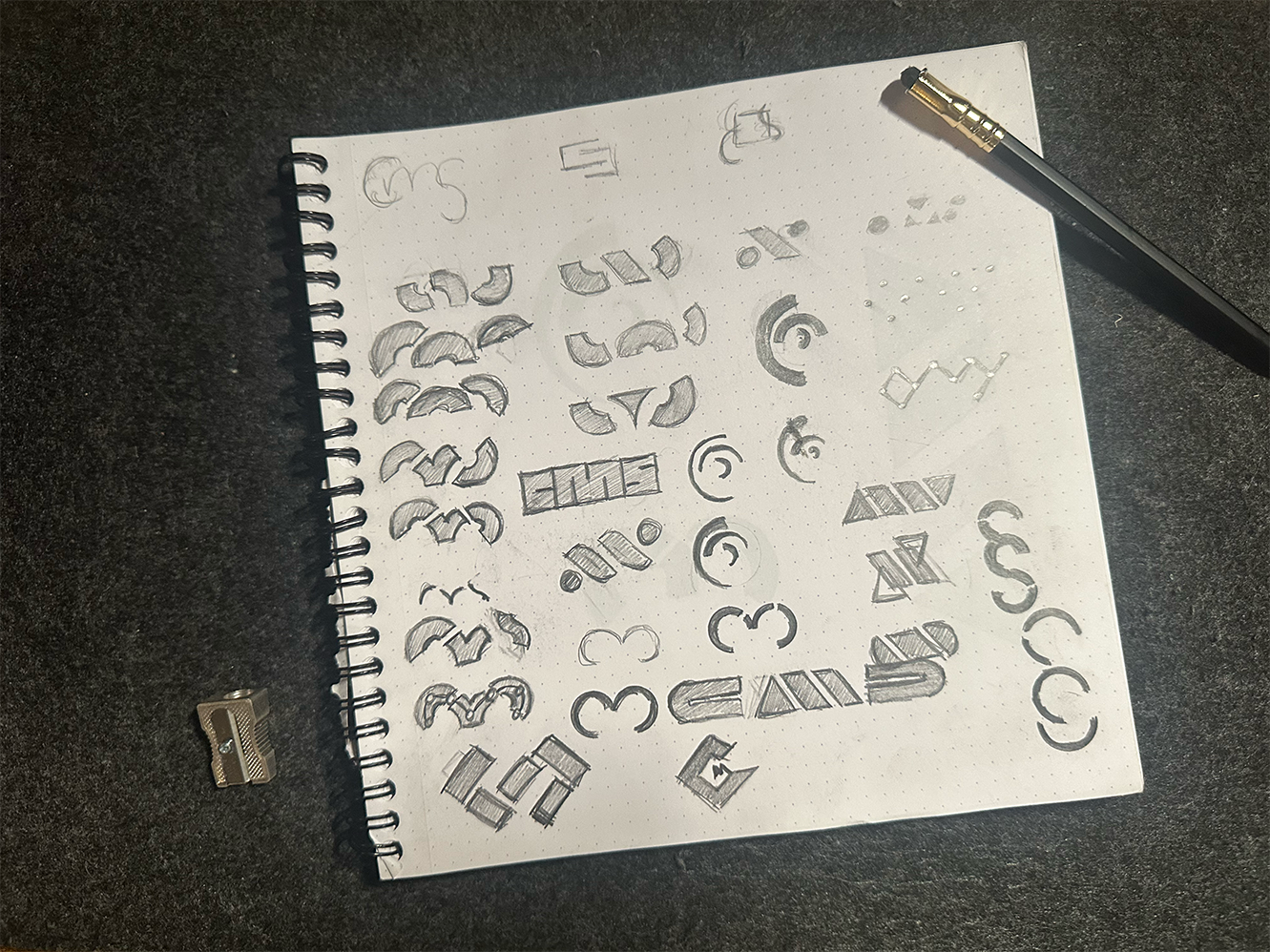
Embodied in the slogan: “Delivering effective results for targeted goals.” At the heart of the identity lies a stylized target composed of three dynamic arcs that subtly form the initials C, M, and S. These arcs swell at their terminals, symbolizing the expressive musical shaping of crescendos and decrescendos—mirroring the nuanced refinement CMS brings to each performance design.
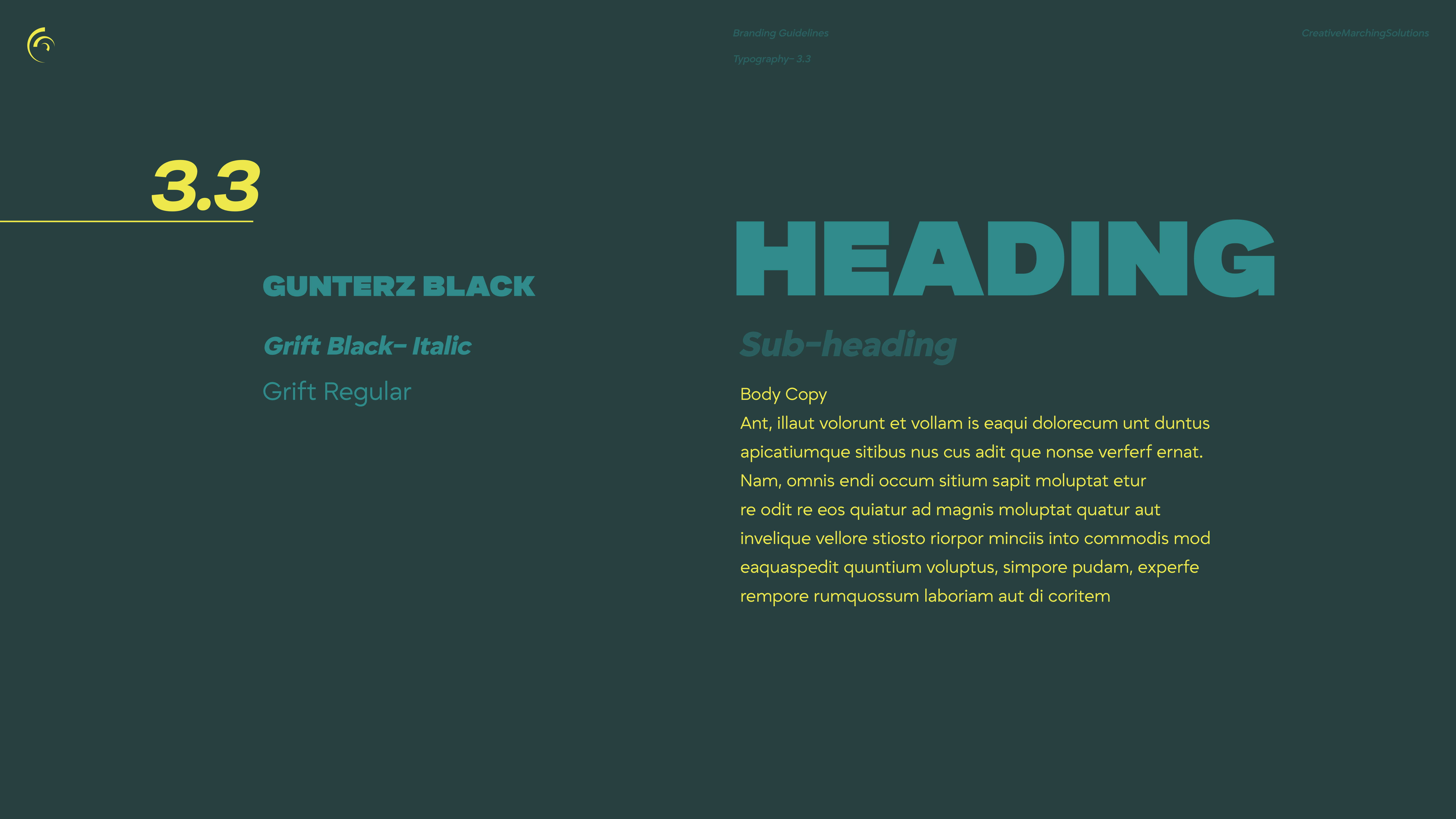
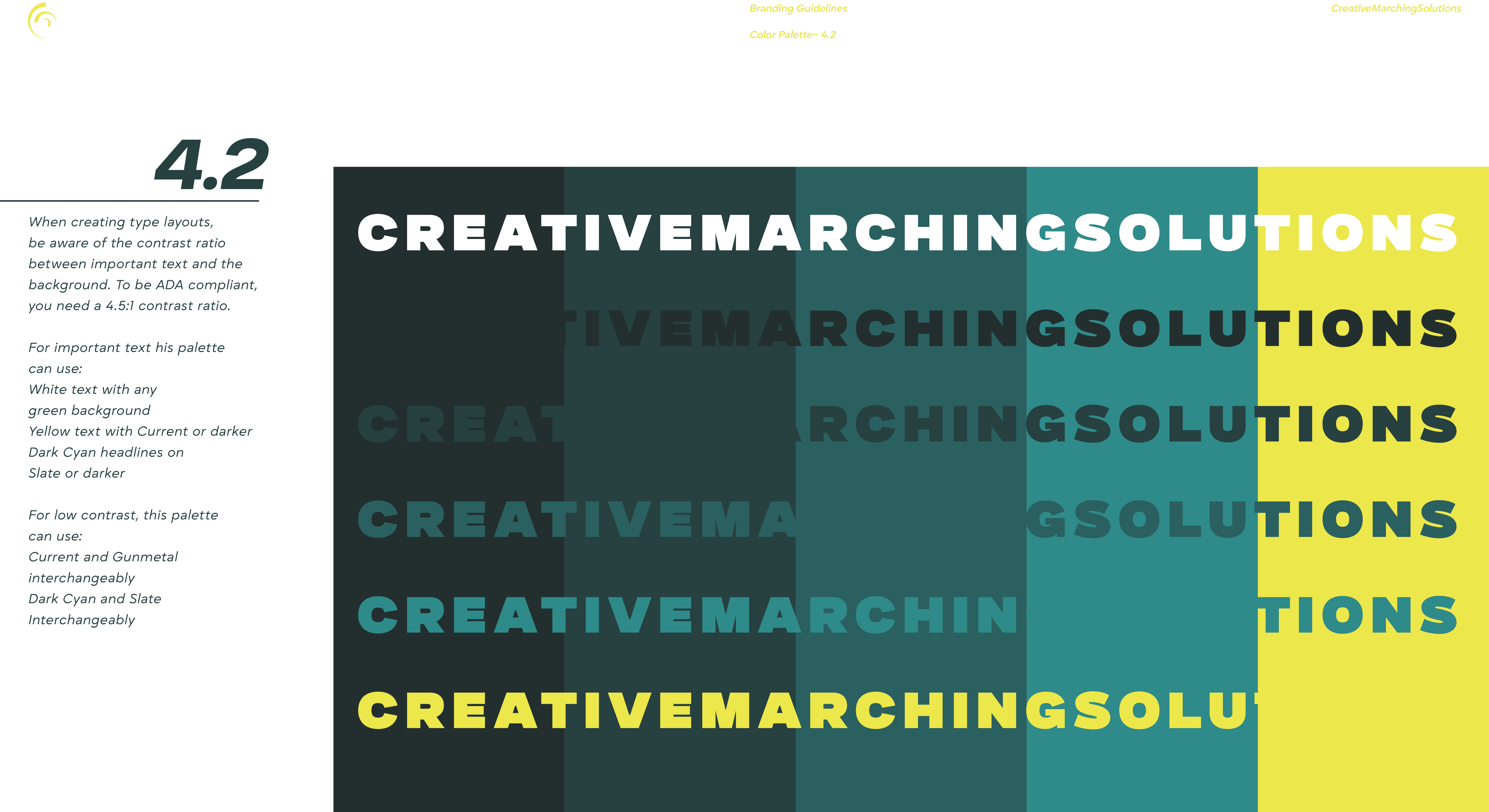
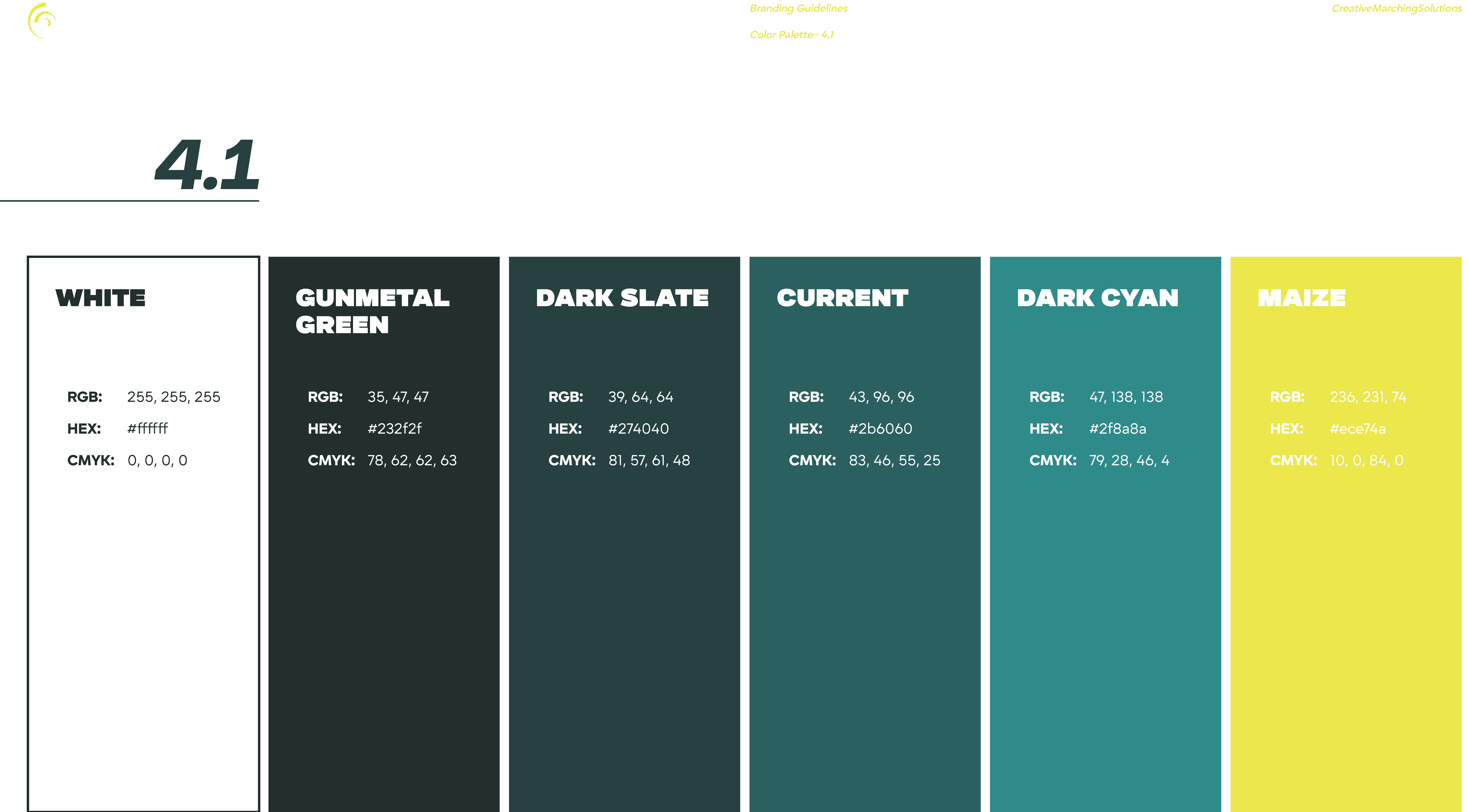
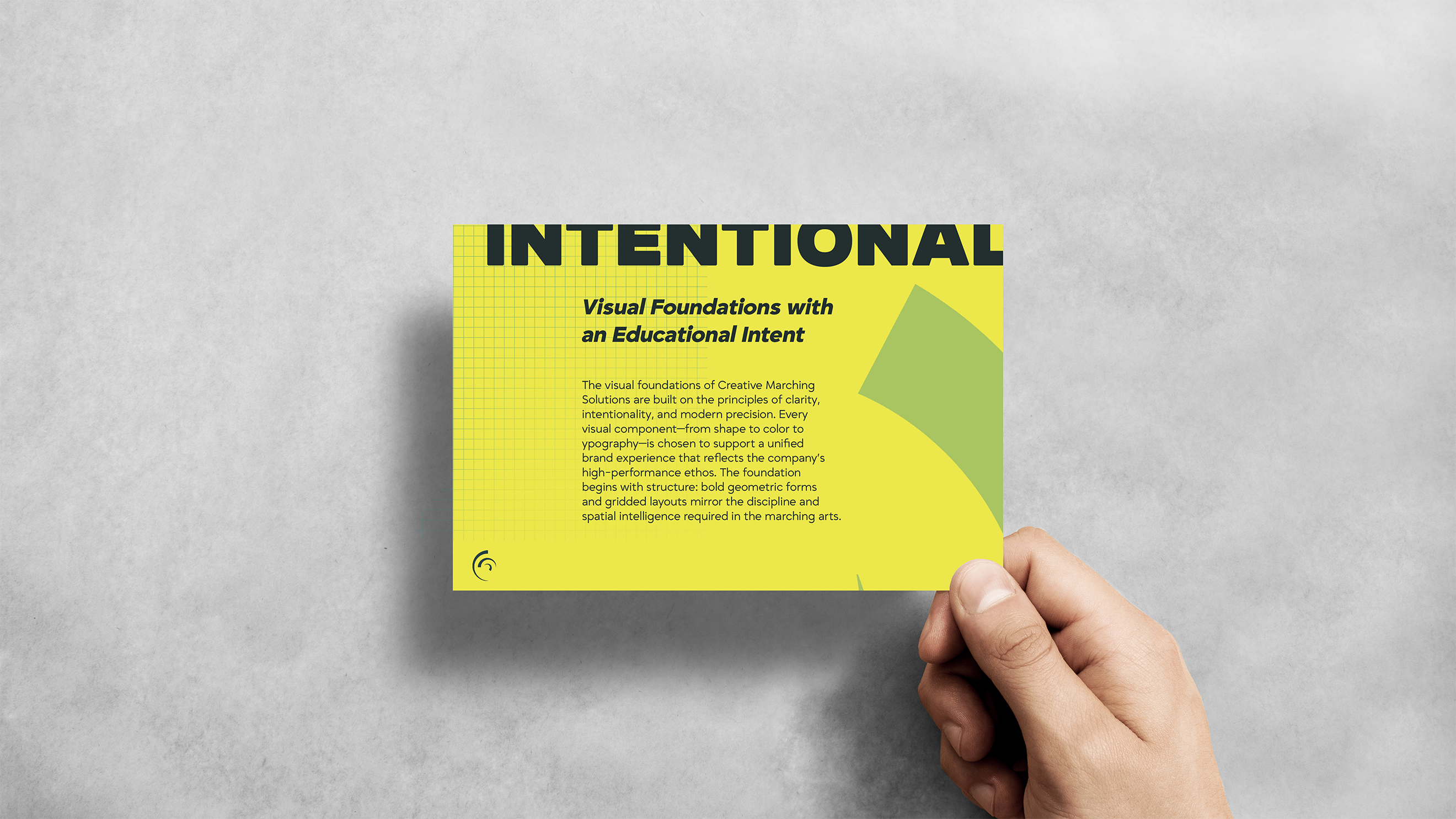
Set against a monochromatic color palette, the interplay between the vibrant yellow and deep teal reinforces a sense of creativity, cohesion, and clarity. The choice of bold geometric typography complements the logo’s contemporary tone—assertive, readable, and perfectly aligned with the company’s modern-yet-expert character. Utilizing a Swiss-styled gridded composition reinforces a sense of structure that reflects CMS’s sophisticated and detail-oriented design process. This visual system is not just a logo, but a strategic identity aligned with CMS’s mission to innovate within experience—striking a perfect balance between artistry and impact.